Diff animations with SwiftUI
A few months back, I wrote a post about implementing custom animations in Android using DiffUtil. In this post, we’ll explore how similar animations can be achieved with Apple’s SwiftUI.
Spoiler Alert: It was a breeze to implement this with SwiftUI. It was an enjoyable experience with the Preview canvas in XCode, and the framework itself is very well suited for stuff like implementing animations.
This post uses GIFs to show off videos of the animations I achieved, but GIFs don’t convey really how smooth the animations are. I encourage you to check out the code and run it on a simulator or iOS device. The code for everything in this post is here. You’ll need XCode 11 and Mac OSX Catalina to run it.
The sample app
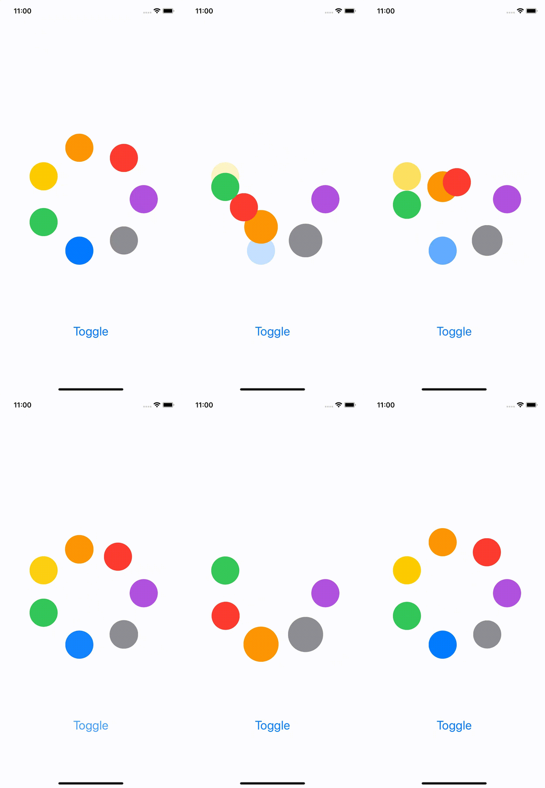
Here’s an example of what we will achieve

This is not exactly the same as the one we ended up in the Android example, but it is close enough.
To recap, this is how it works:
- There are up to 7 colored circle views, arranged in a circle
- Some circles are “expanded”
- When you click on “Toggle”, some colored circles get removed, while others are added, and some get resized (their expansion state changes)
The model consists of 2 pre-defined lists of circle data. Clicking the toggle button simple toggles the state between these 2 lists.
Baseline: Toggling state without animations
The starting point of this experiment is toggling between 2 states, without any animation. For this, I took inspiration from this library to arrange the views in a circle. Then, all I had to do was set the color and size property of each view from the model.
On clicking the Toggle button, I update a @State var property. All this is pretty standard.
struct ColorView: View {    let circleInfo: CircleInfo    var body: some View {        Circle()            .foregroundColor(circleInfo.color)            .frame(                width: self.circleInfo.getSize(),                height: self.circleInfo.getSize()        )    }}
var body: some View {
    ZStack {        ForEach(circleInfoModel.activeCircles) { circleInfo in            ColorView(circleInfo: circleInfo)                .offset(x: /*calculate offset */,                        y: /*calculate offset */)        }
        Button(action: {            self.circleInfoModel.toggle()        }) {            Text("Toggle").font(.title)        }.offset(y: 300)    }
}
The relevant code is in this file and here’s how this looks

Adding animations
This is where SwiftUI impresses. All I had to do was add one line to get nice default animations. Yes, you read that right. It was a one-line change to get animations out of the box.
//Replace thisButton(action: {    self.circleInfoModel.toggle()})
//With thisButton(action: {    withAnimation { self.circleInfoModel.toggle() }})
This change is tagged here and this is what it looks like

I cannot get over how easy this was. Did you notice that we wrote zero code to find out what the diff was, zero code to tell what to insert, what to delete? Nothing. Compare this with what I had to do in the previous article on Android!
But wait, it gets better.
Custom animations
This default animation is okay, but it is not what we want. You can see that item appearance animation doesn’t look all that good. The item just fades in behind whatever was there previously.
How can we improve this? Well, again, just a handful of lines of code. First, create a transition to describe what the animation should look like
extension AnyTransition {    static var custom: AnyTransition {        let insertion = AnyTransition.scale.combined(with: .offset())        let removal = AnyTransition.scale
        return .asymmetric(insertion: insertion, removal: removal)    }}
Then, just apply an animation to each circle view specifying the transition and the curve.
ForEach(circleInfoModel.activeCircles) { circleInfo in ColorView(circleInfo: circleInfo) .offset(x: /*calculate offset */, y: /*calculate offset */) .animation(.easeInOut) .transition(.custom)}And that’s it. With these changes, you get the nice animations that you saw at the top of this post. The code is here.
Note: There seems to be a problem with the Preview Canvas in XCode. It did not show the custom animation when I tried this code. Instead, it kept showing the default animation. Don’t rely too much on the LivePreview feature, especially for animations.
Icing on the cake
If you see the post on the Android implementation, you see this disclaimer:
if you submit a list while animations for the previous diff are already in progress, it could crash
What do we need to make our SwiftUI version handle this case? What happens if an animation is in progress and you click the Toggle button again?
Well, the answer is - you guessed it - We need to do nothing. The animations are interruptible by default. If we click on the toggle button while an animation is in progress, then the next animation starts. Like this

What’s the catch?
This automagical animation feature is fine for a lot of situations, but there are still a lot of them that it might not be able to handle. For example
- Choreographing the animations: If you look at the Android example, we wanted to perform the animations in a certain order (removals first, followed by moves and finally inserts). The SwiftUI version just animates everything simultaneously. You could probably play with
asymmetric(insertion:removal:)to impose some ordering but it would be rather limited. - Animations occur on individual items: What if you wanted the animation to occur in relation to the containing view? For example, what if you wanted to animate scrolling to a different row in a list when the currently “selected” one gets deleted? These are possible but would probably require a lot of code.
There are probably others that I’m missing.
Conclusion
SwiftUI is great for implementing animations. I had to barely write any code to achieve this pretty cool animation (it took me days to achieve the same on Android, and I’ve several years of Android experience!). However, all of this magic does come with its own limitations and it is good to be aware of them before going all-in.